Winging my way to SXSW, I was thumbing through the March issue of American Way, the American Airlines in-flight magazine. Amidst the numerous ads for Argentinian barbecue restaurants (what’s up with that anyway?) I came across this splash graphic introducing an article on how corporate sponsorships are ruining professional sports… or something like that. I didn’t read the article, I was too fixated on the title image. I spent the last 20 minutes before landing trying to name all the logos.
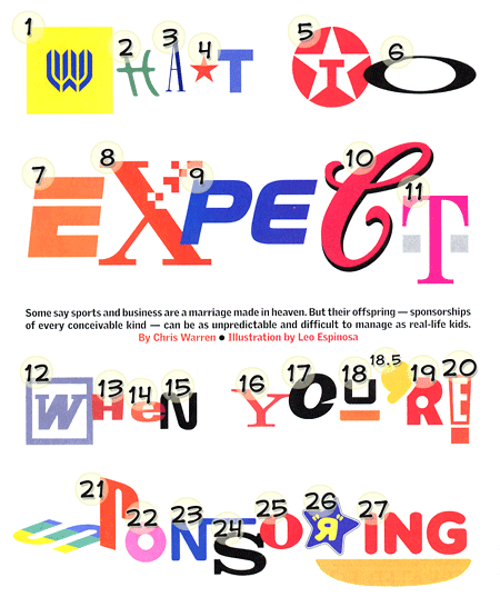
Most of them are instantly recognized no-brainers, but a few had me stumped. So I took the magazine with me, thinking it would be good fodder for a future blog post. In the weeks since, I’ve placed all but three. I’ve uploaded it to Flickr and added my answers as notes. Any help with the remaining three would be appreciated, as it’s been driving me nuts for some time now. (I should also point out that I finally identified the apostrophe between 18 and 19 after I had already uploaded it.) Anyone who can identify logos 3, 13 and 15 will get a gmail invite (as if those were still worth anything). Yahoo 360 invites perhaps?
Update: The quiz is complete, with all logos successfully identified (though one or two may be open to debate). The answers can be found on Flickr.
The logo 15 should be the NASA one. But I don’t know for logos 3 and 13…
Hope it helped ! ;)
15 certainly does seem to match one of the NASA emblems, (the one they embroider on uniforms, not the official “meatball” logo) but NASA isn’t a corporation so it doesn’t seem in keeping with the content of the article or the other logos used in the title. Because it’s such a simple letter treatment, I’m thinking some notable company must use it as well. If it’s NASA, the illustrator made a bad choice.
Logo 3 is from the Gap.
That solves #3, still stick on 13 and unsure of 15.
#15 is CNN
Nope, not CNN, though the curved angles do look similar. But CNN’s logo joins the letters, has a disctinctive double-stroke, and almost always appears in the trademark red.
The logo for number 15 is definately Nissan. And 13? Hm, let me think about that logo some more…
Nope, not Nissan. Their N has sharp corners.
Hm, well I wasn’t observant enough for logo 15. But is logo 13 HEB Grocery Company? I had a friend in Texas confirm that they do have a red on white version of the logo.
Just checked out your link for answers. Okay so 13 is HEB and 15 is the embroidered version of the NASA logo after all. Fun quiz, I’m glad you posted it.
i think that number 13, if you’re still interested, is from the Honda logo, not the main “H” on the badge, but from the word “honda” as it is written on adverts etc
i’m currenty doing a very annoying logo quiz which won’t tell me the correct answers so i’m searching the net!!!
My first thought on #13 was Honda as well, but a quick Google image search proved otherwise. Their name is in a basic chunky square-serif font which I can’t readily identify (looks kinda like a squashed Clarendon or Accolade). Some years back their emblem was updated to the current stylized H, but the name logotype has remained the same for years.
Logo 23 is Nestle.