Web Standards – A Crash Course (Part 2)
Previously…
Last time, we talked about agreeing on the rules of language, and that this agreement allows communication to happen. Writing our web documents in a language the browsers can understand makes our sites work better, and consequently they’re also easier to build and maintain.
We introduced some of the best practices of building standards-compliant websites.
Separation of Layers
Separating the layers of content, presentation and behavior allows each layer to stand on its own without interfering with the others, in turn making them easier to work with.
Accessibility
Ensuring that our sites are reasonably accessible to people with disabilities, such as blind people using screen-reading software or people with diminished motor functions who can’t use a mouse to navigate. Just as a responsible architect shouldn’t design a building with all stairs and no ramps, we shouldn’t build our websites with unnecessary barriers.
Validation
Validating our markup keeps our document correct and well-formed. Valid documents are processed faster on the client-side, and are also easier to convert and manipulate on the server-side. Most pages will still render in a browser even with minor validation errors, but easily-corrected errors should certainly be corrected.
Semantics
And we spent a lot of time talking about writing semantic markup. Semantics is the study of meaning, and in web design it refers to the craft of structuring content with meaningful markup, choosing the most appropriate element to support and enhance the content’s function and purpose.
With all of this in mind, we’ve built a flawless document. It’s semantically correct, completely valid, and reasonably accessible. It�s the perfect web page, magnificent and poetic, truly a sight to behold.
Alas, it’s not very appealing. How do I know where to look for the information I need? How do I even know what site I’m looking at? I probably came here with some goal in mind, but this sure isn’t helping me accomplish it.
Overall this is a pretty unpleasant experience, and unless I’m really driven to slog through all that crap, I’ll just vote with my back button and find something better to do.
It needs some sprucing up, something to make it more useful and memorable and pleasant to be around. We want to lay a coating of visual design on top of our content and structure, but without damaging the utility and integrity of the markup we worked so hard to build.
CSS: Presenting the Web
Cascading style sheets allow us to do just that. We can tell the browser which fonts it should use, what colors to use, and how the various chunks of content should be arranged on the page.
Semantic markup gives our content a meaningful structure, but good markup also builds a solid foundation to support layers of branding and beauty. CSS rests on top of that foundation, making our page attractive and usable while leaving the structure intact and the content unspoiled.
Like other web standards, CSS is a language with its own rules that make it functional and understandable. But it’s neither a markup language nor a programming language, it’s a presentation language that simply tells a browser how it should render HTML elements. CSS works with the markup, coating it with color, typography, imagery and spatial arrangement to give our pages an approachable personality.
But first we have to bridge that gap between layers and connect our markup to our style.
Attaching style
Inline
We can include CSS properties directly in a tag with the style attribute. However, this doesn’t separate the layers, and only serves to bloat the markup and make it much harder to maintain. Inline styles apply only to one element at a time, and should we wish to redesign, we practically have to rebuild the entire site, so we’ve gained nothing. As such, inline styles should be avoided unless unavoidable.
Embedded
A better option is to group our styles together in the document�s header using the style element. This still mixes presentation with our structure, but at least its all collected in one place. Embedded styles are useful for designing a single page, but when there are a lot of pages in a website, we’re once again losing much of the benefit of using CSS for presentation.
External
We can put all our CSS into its own plain text file, and then reference it with the link element in the document header. Any number of pages can now use the same style sheet, and that is where we find the true power of CSS. Our presentation layer is removed from the content layer, and we can modify the external style sheet to redesign an entire website without changing any markup. That style sheet will be downloaded once and cached by the browser, making pages load faster because they’re only loading content and lean, structural markup. And if we like, we can attach more than one style sheet, each with its own link.
But enough with HTML, let�s dig into some CSS and see how it works.
Anatomy of a rule
The basic unit of CSS is the rule, which has just a few component parts.
The selector specifies the element the rule applies to. The property specifies which aspect of the selected element we�re styling, and the value is the particular effect being applied.
The property and its value are separated by a colon, and the pair combine to form a single declaration. A declaration is terminated by a semicolon, which separates multiple declarations within a single rule. All the declarations are held between the curly braces.
Selectors
As the term implies, a CSS selector is what we use to select the HTML element to which the rule should apply. There are several different kinds of selectors in our tool kit, some simple and some rather complex, giving us a great deal of flexibility and precision.
Universal selector
The universal selector does just that — selects the entire universe. The asterisk is a wildcard, so this rule will apply to any and all elements.
Element selector
The element selector consists of an element’s tag name, and the rule will apply to all instances of that element, no matter how many there are or where they occur.
Class selector
Classes are indicated by a preceding dot, and will select all elements bearing the class name. Because classes can be reused in HTML, and because any element can have a class attribute, a single class rule can apply to any type or number of elements.
When creating classes, it’s a good rule of thumb that the class name should refer to the element’s function or purpose, not its appearance. It’s more semantically correct for one thing, and helps further separate content from presentation. But the best reasoning becomes immediately clear when you redesign a few months down the road and a presentational class name is rendered meaningless because its appearance has changed.
It’s easy to become overzealous with classes, assigning a class to every element you want to style. But that’s inefficient and will only clutter your markup with more presentation. There are other, better ways to select the particular element you’re after. We’ll get to that in a minute.
Id selector
Because an id can occur only once in an HTML document, the id selector specifies only that element. As with classes, it’s a good rule of thumb to give your elements meaningful ids that describe their contents or function, not their appearance.
Pseudo-class selector
A pseudo-class selects an element in a particular state. It’s preceded by a colon and there are only a few to choose from — we’re not at liberty to make up our own. Some of these states are only applicable to links, but :hover and :focus can apply to almost any element. That is unless you happen to be using the most popular browser on the most popular operating system. IE 6 (and earlier) for Windows only supports the :hover pseudo-class on anchors, and doesn’t support :focus at all. IE7 rectifies both these shortcomings.
Combining selectors
You can combine some types of selectors to narrow their scope. For example, let’s say the element we’re targeting with the classname “contact” is actually a div. We can make our selector a tad more specific by combining the element selector with the class selector.
Now this rule will only apply to div elements with a class of ‘”contact,” and not any other elements that may bear the same class. This lets us reuse class names for different elements, and each can have different style properties.
You can also combine element selectors with ids or pseudo-classes, and in fact you can combine several selector types into one selector.
As you can see, we’re starting to get more complex, and our selectors are getting more and more specific. But wait, there’s more.
Descendant selector
You can string multiple selectors in a chain to form a descendant selector, which will apply the rule to elements that match the selector’s position in the document tree. This is also sometimes called a contextual selector.
Jargon Alert
The document tree
This is something I forgot to cover in the last presentation, but it ties in nicely with CSS so we�ll cover it now.
The structure of an HTML document can be visualized as a tree. It begins with the html element, which contains all others. That root element has two branches; head and body. Because a browser doesn’t render the head element, it’s beyond the reach of CSS. But everything inside the body is fair game for styling.
Now let’s say our body contains two elements, an h1 and a div; those are both children of the body, which is their parent. Because they share the same parent, they can also be called siblings of each other.
Inside our div we may have two paragraphs� these are both sibling children of the parent div, and are descendants of their ancestor, the body.
Selector recap
Universal, element, class, pseudo-class and id are the basic types of selectors in our arsenal. By using them in various combinations we can style every single element on the page with minimal interference with the markup. Newer versions of CSS introduce a lot of very cool new selectors, but unfortunately they’re not yet supported by IE for Windows, so for now we’re going to stick to these.
Putting it all together
The real power of selectors comes into play when we start using them in combination to narrow the focus of our style rules without the need to give every element a class or id.
As selectors get more complex it can become a chore to figure out just which elements are being selected. A handy way to figure out what a complex selector means is to simply translate it into plain English. For example, the selector “div#content p.intro” can be interpreted as “select all paragraphs with a class of ‘intro’ which are descendants of the div with the id ‘content.'”
Someone has even built an automated translator, called the Selectoracle, where you can enter any selector and it will spit out a plain-English interpretation.
At this point you may have spotted a potential problem. What happens when we have two rules whose selectors apply to the same element?
How does the browser know which rule to follow?
Specificity
Specificity is the measure of how specific a selector is, in other words how many possible elements does it select. The CSS language is designed so that a more specific selector will override a less specific one.
Each type of selector carries a different power of specificity, and that power is cumulative when a selector is made up of more than one of the base types. Here�s the breakdown:
- Universal selector = 0
- Element selector = 1
- Class selector = 10
- Id selector = 100
However, this is a slightly misleading, overly simplified view. In reality, calculating specificity isn’t straight addition, it’s more like stacking values into columns — as we learned in elementary school, we have the ones column, the tens column and the hundreds column. Each instance of a selector type counts as one digit in its respective column.
| Selector type | Hundreds | Tens | Ones |
|---|---|---|---|
| Universal | 0 | 0 | 0 |
| Element | 0 | 0 | 1 |
| Class | 0 | 1 | 0 |
| Id | 1 | 0 | 0 |
This means that a descendant selector made from a string of ten elements is not equal to a single class, and eleven classes is not more specific than a single id.
Let’s try a few example selectors:
div p { ... } consists of two element selectors, so its specificity is 002.
#content p { ... } consists of an element selector and an id selector, so its specificity totals 101.
div#content p.intro a:visited { ... } has three element selectors (div, p, and a), two class selectors (a pseudo-class is treated as a class), and one id, so its specificity tallies up to 123.
But what happens when we have two selectors of equal specificity? Which one wins?
Enter the cascade, the C in CSS.
Cascade
Assuming equal specificity, declarations are applied in the order in which they are received, so later declarations override prior ones. This is true whether the declarations come within the same rule, in a separate rule later in the same style sheet, or in a separate style sheet that is loaded after a prior one. It�s this aspect of CSS that gives the language its name: multiple style sheets that cascade over each other, adding up to the final presentation in the browser.
In the event of more than one style sheet, some preference is given depending on how it is attached to the document.
Browser styles
All modern desktop browsers have their own internal style sheet, defining the browser’s default presentation. This is why a level one heading is larger than a level two heading and why there’s an empty line between two paragraphs. That default browser style sheet is a starting point, and is applied first.
User custom style sheet
Many browsers provide some means for a user to attach their own custom style sheet, which overpowers the browser defaults.
External author style sheet
A linked author style sheet overpowers the user styles.
Embedded author style sheet
Rules embedded in a style element in the document overpower an external style sheet.
Inline style attribute
Inline CSS properties in the style attribute overpower embedded styles.
So when it comes to remembering the cascade order, the key is this: The rule closest to the content wins.
Unless�
The cascade order can be upset by a special keyword command: !important. When the important keyword appears with a value, it instructs the browser that this declaration should always be honored, regardless of its place in the cascade or the specificity of its selector. The !important command is very powerful, and with great power comes great responsibility. Use it wisely and sparingly.
This was introduced as a sort of check-and-balance between author styles and user styles. In CSS2, !important user styles override !important author styles. Since a user can make declarations important in their custom style sheet, and can also configure their browser to simply ignore all author styles, the ultimate power goes to the user, as well it should.
Of course very few people write their own style sheets or disable CSS in their browsers, so it’s not something to be overly concerned about, just a reality we must accept. It’s a simple fact that we can’t guarantee with absolute certainty that our style rules will be honored. This is one more reason correct, semantic markup is important. We don’t always know that our presentation rules will be obeyed, but we can rest easy with the knowledge that a paragraph will always be a paragraph.
Properties
We’re finally moving inside the curly braces to talk about CSS properties. The selector lets us target an element, and the property is the aspect of the element’s presentation we’re manipulating by providing our own values. We may suggest a particular typeface, or a background image, or tell a block of content to be a certain width and place itself in a certain location.
The full list of CSS properties looks rather intimidating all crammed onto one slide, but all things considered it’s really not that bad. Luckily the CSS language is designed to be human-readable. Most of these properties do just what they say, and — like any other technology — you just pick it up as you go along.
Aside from coping with all the various browser bugs and quirks, the hardest part of learning CSS is getting to know all the little particulars of how these properties interact with each other, and what values can be legally assigned.
One important thing to understand is inheritance.
Inheritance
Some properties of an element will be inherited from its ancestors, especially those dealing with fonts and typography. If something isn’t looking the way you expected it to, it may be inheriting properties from an element further up the tree.
Inheritance is a good thing because it means we don’t have to redundantly declare the same properties on every rule. For example, since most font properties are inherited, we can declare our baseline font properties for the body element, and every other element will inherit them because they all descend from the body.
If we come upon another element that we want to style differently — a different color for headings, for example — we only have to re-declare the properties that differ from the inherited style. Specificity and the cascade let us override those baseline properties, and allow the others to inherit normally.
Inheritance is sometimes confused with the cascade, but they’re very different. Styles are inherited from ancestral elements in the HTML, paying no attention where the rule appears in the style sheet. This is important to remember when you’re trying to figure out why your text is so much larger than you meant it to be. A rule 50 lines away in the style sheet (or in another style sheet entirely) may be influencing it.
When you’re writing CSS you need to always remain cognizant of inheritance, the cascade, specificity, and the tree structure of your document. Use these things to your advantage to make your style sheets lighter and more flexible.
Which segues nicely into the subject of optimizing CSS.
Optimizing CSS
Even though an external style sheet is only downloaded once and then cached, it still has to be downloaded. So anything we can do to make our CSS more compact will make the file smaller and speed up that initial pageview.
We’ve already talked about the advantages of inheritance and the cascade to help minimize redundancy. By declaring our base styles for an ancestor element, we can allow its descendants to inherit without repeating those declarations over and over.
We can also list multiple selectors in a single rule, separated by commas. This means we don’t need a lot of duplicate rules to apply the same set of declarations to more than one element.
And by taking advantage of inheritance, cascade and specificity, we can group several selectors under a common rule, then call out only the different properties in a later or more specific rule.
CSS Shorthand
Another way to minimize CSS is by using shorthand properties and values. Let’s add some more properties to our body rule.
Here we’ve added a foreground color for our text, and a light gray background color for the entire page as well as a background image positioned at the top left corner of the element, and we’ve told it to tile in both directions.
This can be significantly condensed with shorthand:
Font and background are shorthand properties that can accept a chain of values. The values need to come in a specific order, and any that are missing are magically filled by the default values.
Most properties in CSS have a default value specified by the W3C. We can use these to our advantage by not re-declaring them and letting the browser do some of our work for us.
According to the spec, the default value for the font-weight property is normal, so there’s no need to include it here. A background image will be positioned at the top left by default, and will also tile by default, so those values are redundant as well. After cutting out all the extraneous stuff and letting it cascade to the defaults, we’ve condensed our rule to this.
But we can condense it a little bit more.
Notice we’re specifying our foreground and background colors with hexadecimal values. If you’re using hex colors, and each pair of digits is matching, you can shorten it to only three digits instead of six, saving a few more bytes.
But as we know, CSS works for more than just text. Let’s do some decorating.
Imagine a paragraph…
And we’ll give it a class so we can differentiate it from other paragraphs. In CSS slang, we call this a “hook” because it gives us a device from which to “hang” more specific styles.
Its text will already be 12 pixel blue Trebuchet because it’s inheriting those styles from the body. But we want to set it off a bit more — how about a solid red border all the way around?
That’s a lot to type just to draw a rectangle. But luckily we have the shorthand border property. Because all four sides are the same, we can get the same effect with a single declaration:
We can still specify individual sides of the box with long-hand properties, and if they come after the first declaration, the new value wins out in the cascade.
Because we’re only changing the width of the left border, the border style and color still carry through.
But our paragraph is looking a little cramped — how about some padding between the content and the border?
And of course we can shorthand it like this:
But I don’t actually want the same padding all the way around, I’d like a little more on the left and right sides. There’s a shorthand way to do this too. When the top and bottom values of a box are the same, and the left and right values are the same, we can specify all four sides with only two values:
The first applies to both the top and bottom, the second applies to the right and left. If we wanted to have different values for all four sides we can still do it in a single property, and they needn’t all use the same unit of measure:
The order of the values goes clockwise — top, right, bottom, left — separated by spaces. Borders and margins can be declared the same way. Notice that there�s no unit required for values of zero. Which is longer, zero inches or zero miles? Zero is always zero, so we can save two more bytes by leaving off the unit.
Reducing white space
One more thing that can have some impact on file size is reducing the amount of extraneous white space in a style sheet. CSS can be made more readable by placing each declaration on its own line, and by inserting blank lines between rules.
But every space, tab and carriage return is still a character being saved in the file, so each one adds a tiny bit more data to your file. You can save a bit of file size by scrunching each rule onto one line. If that’s too hard to read, what with all the horizontal scrolling it can demand, you can always author your rules expanded onto separate lines, then go back and chop out the extra white space when you�re done. You can save even more by eliminating all extra white space, compressing your entire style sheet onto a single, uninterrupted line, but heaven forbid you should ever need to edit that style sheet again.
The Box Model
A minute ago we talked about box properties for margins, borders and padding. Every element on a page lives in a box the size of its content area. By default, block-level elements form boxes that expand to the full available width of their parent box, and will be the same height as their contents. Outside the content area, there are optional areas for padding, borders, and margins. All of these can be modified with CSS.
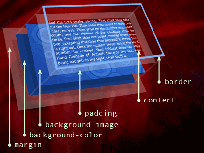
Here’s a three-dimensional visualization of the CSS box model, my tribute to Jon Hicks. Working from the outside in and back to front, we have an invisible margin area between the edge of this element and its adjacent elements. Inside the margin, we can apply a background color, and a background image will overlay that. Padding is invisible space between the edge of the box and its contents, and the background will show through the padding area. Overlaying all this is a border, outlining the visible edge of the element.
A large part of designing with CSS is the art of carefully manipulating boxes. It’s not quite as simple as it sounds, so it’s worth exploring the box model a bit further because there’s a history of confusion around it. First we’ll set the stage.
Here’s a rule giving our paragraph a border and some padding:
Remember, paragraphs are block-level elements, so by default they’ll expand to the full width of their parent. But we don’t want ours to stretch all the way across the page, we want it to be exactly 200 pixels wide. So we add a width property.
You would expect the resulting box to measure 200 pixels from border to border, but what you actually get is a box 224 pixels wide: 200 pixels, plus 10 pixels of padding on each side, and two pixels of border on each side. Believe it or not, this is correct.
In CSS, padding and borders are added to the declared width of an element. This seems counter-intuitive, and hence has confused a lot of designers when they start trying to use CSS for page layout. After all, when you buy a new TV, they put the Styrofoam padding inside the box.
Just remember, the width property declares the width of the element’s contents, not its box.
To get a box 200 pixels wide from edge to edge, we subtract the width of the borders and padding from the desired width (200px – 2px – 10px – 10px – 2px) and end up with a content width of 186 pixels.
Now that we understand the box model, we can begin to really design our elements by changing the size and appearance of their boxes. But CSS can also control page layout by rearranging those boxes. There are two methods for moving boxes: floating and positioning.
Floating and Positioning
First we’ll talk about the float property, which has three accepted values: left, right, or none. When you tell an element to float to the left, it will pack up its things and move to the left as far as it can until it runs into something that stops it, either another element or the edge of its parent box. The floated box is partially removed from the normal flow of content, so the content that follows it can then flow up around our box in ancient graphic design tradition.
This is all well and good until we get more than one box floating around on our page. Imagine we have a box containing two other boxes, one floated left and the other floated right. But remember, floats are removed from the normal flow to allow content to wrap around them. There’s nothing else inside this container to tell it where its bottom should be, so it will collapse vertically, and its floating children will spill out the bottom.
This isn’t a problem if that container is invisible, we can let it collapse and not be too concerned. But if there is other content on the page, it will flow up between our boxes, which may be undesirable.
To get that wrapper to contain its floats, we need something else to clear them and push the bottom of the box down.
The most common method of clearing floats is to insert an empty >div<</div> or a clear: both; declaration, which tells the browser, “don’t let any floats come below this line, and don’t let any content come above it.” But that div is non-semantic, presentational markup, so maybe we can find a better way.
A nifty trait of floated boxes is that they will naturally wrap around and contain other floated boxes. So if we float our wrapper box, it contains its floating children all by itself without any extra markup. It’s possible to create very complex and flexible layouts by floating nearly every element, and carefully controlling how they collide and interact.
One drawback of floats is that they are somewhat dictated by source order. In order for content to wrap around a float, the floated element must come before that content. Also, floats only work horizontally — we can’t move a float upwards or downwards on the page, its top edge will be where the top edge would be even if it weren’t floating.
If, for one reason or another, floating doesn’t get us where we need to go, we can position elements very precisely with the position property. This has the advantage of letting us move a box both horizontally and vertically, and we can move it anywhere we like regardless of where that element appears in our markup source.
If a paragraph comes after a bunch of other content, but we’d like it to appear in the top right corner, we can just position it there. But positioned elements are completely removed from the normal flow of content; the rest of the page is blissfully unaware of where that box lives. So now our content appears behind our positioned box, instead of wrapping around it as it would if the box were floating.
The only way to avoid this overlap is to somehow carve out a space in our content for the positioned box to sit in. We can do this a few ways: by floating or positioning the other content in a box of its own, or by giving it ample padding or a margin that the positioned box can overlap safely. So, as with floats, using positioning for especially complex layouts can become troublesome. It’s generally best to float or position just a few major building blocks, and then let the contents inside those blocks flow naturally.
There are a few different values of the position property: static, fixed, relative, and absolute. Each of these behaves in different ways.
Static is the default, and simply means the box will be positioned as it would in the content’s natural flow.
Fixed will put the box exactly where we want it and it won�t budge from that spot, even if the window scrolls or is resized. Except in IE for Windows, of course, which doesn’t support fixed positioning.
Relatively positioned elements are placed relative to where they would appear if they had a static position, so we can nudge the box in any direction using its natural placement as a starting point.
Absolute positioning will place a box at a precise location within its nearest positioned ancestor. If it doesn�t find a positioned ancestor it will be positioned within the the browser portal.
But if it’s wrapped in some container that is itself relatively positioned, the nested box will be absolutely positioned inside that container. If the relatively positioned container lacks a top, left, right, or bottom value, it behaves as if it had position: static, which is to say it won’t move at all from its normal placement. Very nifty.
CSS Stunt Spectacular
We’ve barely scratched the surface of CSS, but we’ve got a grasp of some of the basics. Let’s take a look at just a few of the clever things we can do with it.
Image replacement
Text on the web can only be displayed using the fonts installed on the user’s computer. This limits us to about a dozen common fonts, few of which are especially attractive, and even those can’t always be counted on.
To have true typographic freedom, we have to use images; a picture of text instead of actual text. But inserting an inline graphic starts to damage our wonderfully semantic markup. It’s mixing presentation with structure, and raises some obvious accessibility issues. With CSS we can keep the normal text in the document, and just hide it from graphical browsers while letting a background image show in its place.
There are a lot of image replacement techniques, each with their various benefits and shortcomings. One of the best and most popular methods was invented by a talented guy named Mike Rundle, and it’s the one I prefer.
We begin with a semantically correct element containing perfectly functional text content. In our style sheet, we apply a background image to the element, as well as a width and height to make sure our entire background will show. Then we include a text-indent property with a really large negative value, moving the element’s text way off to the left, well outside the browser window. The final piece is the overflow: hidden; declaration, which hides the text now that it’s being pushed outside the width we declared and preventing a 10,000-pixel-wide horizontal scrollbar.
So for browsers that support CSS, the text is hidden and the image is shown in its place. The text will also be read by screen-readers and search engines, so we�re keeping our content accessible and findable. The only real problem with image replacement is the fairly uncommon situation where a user has disabled images but still allows CSS. That’s probably a small percentage of visitors, but it’s still an issue, so generally image replacement should be used sparingly, and only for things like titles, never for body copy.
Elastic layout
Most browsers allow a user to resize text. It’s an important accessibility feature for those with less-than-perfect eyesight, or people who simply prefer to read larger text. When text is resized, the box that contains it will expand vertically while the width remains the same. But there’s an easy way to make the box expand with the text in both directions: by specifying its width with a proportional unit.
Most units of linear measure available in CSS are absolute: pixels, points, centimeters, etc. Percentages are relative, calculated as a percentage of the parent element’s width. But there are a few proportional units at our disposal — em and ex — which are calculated as a proportion of the element’s text size. An em is the height of a capital letter in the chosen font, and one ex is the height of a lowercase letter (not counting ascenders or descenders, the “ex height” in typography lingo). Since the size of an ex can vary a lot between typefaces, it’s a bit unpredictable so we generally prefer ems.
As the size of text changes, so does the relative size of a proportional unit. Setting our base font-size at 62.5% makes one em equal to 10 pixels (based on a browser default size of 16px) in turn making our math much easier — 1.4ems is 14 pixels, 34ems is 340 pixels, etc.
So if we make a box 18.6ems wide we get our magic 186 pixels. When the text is scaled up or down, the box scales with it. We can now create an entire layout that will expand and contract with the text without breaking.
Sliding doors
The “sliding doors” technique was popularized by Douglas Bowman, who premiered it on A List Apart three years ago, and since then it’s become commonplace. Essentially, the technique consists of layering background images on two nested elements in such a way that the background seems to expand as the element expands — the two halves of the image can “slide over” each other to accommodate differing contents.
The classic specimen for the sliding doors technique is the ubiquitous tabbed navigation. Since a navigation system is, in its Buddha-nature, a list of links, it makes good semantic sense to mark it up as (wait for it) a list of links. And because each item consists of two elements, and because CSS allows us to apply a background image to almost any element, we have the two elements required for sliding doors without introducing any extra, presentational markup.
We apply one background to the li element, and the other to the a, and position one to the left and the other to the right. The trick is that one image is much larger than the final tab will be, which gives the element room to grow. Our tabs can now accommodate a reasonable length of text, and can also accommodate text of different sizes. It remains accessible and inter-operable because it’s still a simple list of links, we’re only altering its presentation.
Conclusion
Content and design are a very close couple. Content without design is harsh and unapproachable, and design without content is vapid and frivolous. But together they make something more than the sum of its parts.
But design isn’t just decoration, it’s a vital part of communication. Good design enhances and supports the content. It establishes a mood and a tone, is instrumental in brand recognition, and guides a person toward their goal. For the sighted majority, a website’s visual design is their first impression, and is usually the most lasting.
Cascading style sheets give us the freedom and the power to make the web beautiful, without destroying it in the process.
In this presentation we’ve barely scratched the surface of what there is to know about CSS and the many ways we can use it. I didn’t mention some of the advanced features in CSS2.1 and CSS3; attribute selectors, pseudo-elements, generated content, etc. I glossed over a lot of design tricks and techniques; faux columns, collapsing margins, fixed backgrounds, and so on. And I deliberately avoided the tar pit of CSS bugs and the hacks to evade them.
But I hope you’ve at least found a good starting point with CSS and reached a better understanding of its inner workings and advantages. If you’d like to explore more on your own, I urge you to read some of the many good resources available, both online and on paper. Above all, just experiment and enjoy.