Dave Shea has written an excellent introduction to CMYK, mainly aimed at web designers used to creating for the RGB screen. It’s a handy overview of the CMYK color model and why your work doesn’t look the same on paper as it does on the monitor. Dave’s article offers some rules of thumb to follow to trick CMYK into behaving more like RGB. However, the CMYK model is a gamut all its own, and is best understood on its own terms. This started as a comment on Dave’s post, but quickly grew into something that warranted a post of its own.
 CMYK, if you don’t know, is an abbreviation for the four different ink colors (Cyan, Magenta, Yellow and Black) which are used in combination to approximate the entire range of colors visible to the human eye. So why use “K” for Black instead of “B”? Contrary to popular assumption, it is not only to avoid confusion with “blue”, but also because black ink is the “Key” color, the one used to add depth to shadows and sharpness to midtones. If you view a piece part-way through the printing process, before the black ink has been applied, you’ll see it looks pretty much like the final product. The colors are all present, they just look flat. The addition of some black shading makes the other colors pop and brings out the detail.
The Light Fantastic
Color is light — electromagnetic energy traveling in waves. Our optical cells, the photosensitive rods and cones in your retina, are only capable of absorbing a limited range of wavelengths, which results in a narrow visible spectrum of colors. The primary colors of light are red, green, and blue. When those three primary wavelengths combine in differing intensities, our brain processes the mixture as additional colors like yellow, orange, violet and white. The color mixing all happens in the brain.
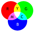 We’ve all seen this color wheel before: the three primary colors of light mixing and merging to form the three secondary colors and white. The RGB color model refers to light being generated directly from a source, such as a computer monitor, a light bulb, or a violent nuclear reaction in space. Colors in RGB are achieved by combination, adding wavelengths together, so RGB is described as additive color.
However, a pigmented surface isn’t generating light, it’s reflecting it. Different colors are achieved with pigments by absorbing some wavelengths and reflecting others. That’s subtractive color, removing the waves we don’t want and allowing the others to reflect as usual. Unlike opaque pigments like most paints, the inks used in four-color process printing are translucent, allowing some light to pass through to the substrate (the paper) to then be reflected back to the eye while other wavelengths are absorbed into the pigment. Obviously this only works with white or near-white substrates which are highly relective.
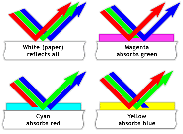
Even with the brightest bleached and coated superwhite paper stock, bounced light is never as pure as generated light. The inks also don’t always absorb 100% of the color they’re meant to. That is why images look completely different on paper than they do on screen.
Connect the Dots
 Printing with ink is binary: in a given area, there is either ink or there is no ink. Continuous-tone images (made up of seamless gradations from one color to another) are simulated by breaking them up into dots of varying size and density to make a halftone. Small dots far apart in the highlight areas, fat dots close together in the shadow areas. It’s an optical illusion that, from a distance, the dots seem to merge into smooth shading. Step back from your screen and see how far away you have to get to recognize the guy to the right.
The overall quality of a halftone is determined by the size of the largest dots. Printers measure this in lines per inch, or lpi. The more rows of dots packed into an inch, the smaller the dots will be, and thus the closer to a true continuous tone the image will appear. Low quality printing on pulpy, porous paper (like newsprint) will probably be printed at 65-85 lpi. Because the newsprint is so porous, the dots of ink will tend to soak in and expand, a phenomenon refered to as dot gain, making it nearly impossible to get clean, tiny dots. High quality printing on coated paper (like glossy magazines) will be printed at 150lpi. Much higher than that and the dots are simply too small to get any ink to stick at all. While lpi is a measure of dot frequency, the dots themselves are measured by the percentage of the dot area covered by ink, with 100% being solid and 0% being inkless.
 Color halftones are created by layering dots of the four ink colors (remember CMYK?). Each solid dot of ink absorbs one wavelength of light (or all three in the case of black), reflecting the other to create a color. The mashup of halftones produces a perceptual blend of light waves, tricking the brain into believing it’s seeing a full-color continuous-tone image. It’s really quite cool.
More Rules of Thumb
To follow up further on Dave’s article which inspired this, here are some basic things to keep in mind when preparing digital images for printing:
Resolution. Printed images are made up of dots but electronic images are made up of pixels. To avoid that pixelation being visible when printed, you want your original pixels to be smaller than the ink dots. The standard rule is that your digital resolution should be twice the output line screen. In layman’s terms, you should have twice as many pixels in an inch than dots, or one dot for every two pixels. If the work will be printed at 150lpi (standard for quality color printing), your images should be 300ppi at a minimum.
Density. Areas of extreme light or dark will print as either blank paper or solid ink. This is undesirable since those areas will carry no detail (and solid patches of ink will tend to smear and gum up on the press). Ideally, you should have no dots smaller than about 3% in the highest highlights and none larger than about 95% in the deepest shadows. The only time uninked paper should show in an image is in a specular highlight, a hard reflection of pure light like a shine on a bumper.
Gray balance. Cyan is optically the weakest color in four-color process because it reflects blue and green, which are the weakest wavelengths at the shorter end of the spectrum. As such, it usually needs to be boosted a tad to compete with the yellow and magenta. A neutral medium gray should be in a 5:4:4 ratio, meaning 50% cyan, 40% magenta, and 40% yellow. Or 6:5:5, 3:2:2, etc. As long as there’s a bit more cyan ink than there is yellow or magenta, the resulting color will be closer to reality. If all three are the same screen, your colors will tend to look too warm or muddy.
Compliment reduction. Making a color appear more intense in print isn’t always about increasing the amount of ink that makes that color, it’s often about reducing the amount of ink that is making it dull. To get a vividness bump, cut back on the complimentary color. To get your blues really blue, cut out the yellow.
Compression. Web designers spend a lot of energy learning how to make image files as small as possible while maintaining the highest possible quality. If you’re going to print, unlearn what you have learned. GIFs and 8-bit PNGs reduce the image’s palette to a maximum of 256 colors. JPEG and 24-bit PNG compress by discarding redundant pixel data and re-interpolating the lost colors based on adjacent pixels. Both of these methods reduce the file size by reducing the amount of data stored (duh). But ultimately removing that data also removes detail and quality. JPEGs are blurry and GIFs are jaggy. Bitmapped images for print should be TIFFs or EPS. JPEG is sometimes allowable if it’s high resolution and saved at maximum quality (JPEG is a variable loss format), but it’s not the best choice. And all images should be saved in CMYK mode, of course.
The craft of print is broad and complex, as full of jargon and techie geekness as the web. But applying what you know of one field to the challenges of the other is as much a matter of letting go of old notions as it is of gaining new knowledge. This brief summary can’t even begin to scratch the surface of what a print designer needs to know, but hopefully I’ve covered enough of the general concepts to make my fellow web geeks a little more comfortable when switching from pixels to dots.
You always post good stuff !
Keep up the good work !
Hey Majed, been awhile. Give me a call, we’ll catch up.